Shopify Product Page CRO: 7 Fixes That Move the Conversion Needle
The average Shopify product page converts at 1.4%. These 7 code-level fixes address the specific friction points killing your add-to-cart rate.
Shopify product page optimization is where most brands leave the most money on the table. The average Shopify store converts at 1.4%. The top 20% sit at 3.2% and above. That gap is not checkout friction — it is what happens on the product page before the customer ever reaches checkout. A store doing $80K per month at 1.4% that lifts to 2.8% doubles revenue without adding a single new visitor.
Why Most Shopify Product Page Optimization Focuses on the Wrong Things
The most common mistake: brands optimize their checkout while ignoring the product page where over 60% of abandonment happens. A customer who does not add to cart never reaches checkout. Fixing checkout is the second problem. The product page is the first.
Generic CRO advice helps — faster pages, cleaner checkout flow — but it does not address what is actually stopping the customer from clicking add to cart.
The Decision Zone
The concept that explains most product page failures is the decision zone: the screen area containing the add-to-cart button on mobile. Whatever is visible in this zone when the button appears is doing the persuasion work. Most Shopify stores have price and button only. Winning stores have star rating, delivery promise, returns policy, USP, and the button — all visible without scrolling.
Key Insight
The decision zone is the mobile screen at the add-to-cart moment. Whatever fits there is doing all the persuasion work. If it is just a price and a button, you have already lost the undecided customer.
Fix 1: Build a Decision Zone Around the Add-to-Cart Button
Open your store on a mid-range mobile device and scroll to the add-to-cart button. What is visible on that screen without scrolling? If the answer is "price and button," you have found the most expensive problem on your product page.
What belongs in the decision zone
The decision zone should contain: price (with any savings framing if applicable), star rating and review count adjacent to the product title, a one-line delivery promise, a one-line returns statement, your primary USP, and the add-to-cart button.
No app is required. This is a Liquid section re-ordering in the product template — moving trust and delivery blocks above the description and within the sticky area. A developer can implement this in a single focused session.
Abandonment at the add-to-cart moment is more costly than checkout abandonment because it happens earlier. A customer who reaches checkout has already made the purchase decision. A customer hovering on add-to-cart has not. That undecided moment is where the decision zone pays off.
Fix 2: Social Proof Placement, Not Just Social Proof Volume
The standard advice — "add reviews to your product page" — misses two implementation details that determine whether reviews help or hurt conversion.
The review count threshold
According to Build Grow Scale research, fewer than 15 reviews on a product page decreases conversion by 7% compared to showing no reviews at all. Shoppers who see 8 reviews interpret it as evidence that few people buy this product. Set a conditional rule in your review app to hide the widget below that count. For those products, show brand-level trust signals instead: certifications, press mentions, or a "3,000+ customers" brand badge.
| Review count | What to display |
|---|---|
| Fewer than 15 | Hide widget entirely. Show brand trust badges — certifications, press, total customer count. |
| 15 to 49 | Show star rating and count inline, adjacent to the price. No full review section. |
| 50 or more | Show full review section below the description, plus inline star rating near the price. |
Placement specificity
Review widgets placed everywhere are processed as background noise. What converts is a star rating and count adjacent to the price — not below the description — and a single outcome-specific review quote pulled into the decision zone, positioned next to the add-to-cart button.
Fix 3: Sticky Add-to-Cart on Mobile
A sticky add-to-cart button — one that remains visible as the user scrolls through descriptions, images, and reviews — lifts mobile conversion by approximately 8%. For a store generating $40K per month in mobile revenue, that is $3,200 per month from a single implementation.
Most Shopify themes, including Dawn, do not have this natively. The standard recommendation is to install an app. Do not. Every app that injects a sticky element via JavaScript adds 200 to 400ms to your LCP.
Sticky add-to-cart is approximately 20 lines of CSS and JavaScript added directly to your theme. In your Shopify theme editor: go to Online Store > Themes > Edit code, locate your main-product.liquid section, and add a fixed-position container that appears on scroll below a defined threshold. A developer can implement this in under an hour.

Fix 4: Rewrite Product Descriptions as Purchase Arguments
Most Shopify product descriptions are written for the brand, not the customer. Feature lists, technical specifications, and marketing copy that describes the product without addressing the customer's purchase question.
The purchase argument structure
Write in three layers: benefits (what does this do?), outcomes (what changes for the customer?), and objection handling (what is the customer worried about?). In that order.
A structure that converts: one sentence on what the product is, three sentences on what it does for the customer in their own language, one line handling the primary objection, one line creating a reason to buy now. That is the full description — not a paragraph of "crafted with care" copy followed by a bullet list of materials.
Fix 5: Delivery Promise and Returns Certainty Above the Fold
According to the Baymard Institute, unexpected shipping costs are the number one cause of cart abandonment — cited by 49% of abandoners. The relevant insight for product pages: this anxiety does not originate at checkout. It starts on the product page, when the customer begins calculating whether the total cost is worth it.
Baymard Institute
49% of cart abandoners cite unexpected costs as the reason. Showing delivery cost on the product page — not just at checkout — pre-empts the number one abandonment cause before it can take hold.
The implementation is a single line of HTML added to the product template, positioned above or adjacent to the add-to-cart button.
The copy formula: specific outcome, specific condition, specific timeframe. "Free delivery on orders over $50. Ships within 1 business day." That one sentence does more conversion work than three paragraphs of brand story. Same for returns: "Free returns within 30 days. Drop off at any return location." Specificity reduces anxiety more than a generic promise.
Fix 6: Video in the Gallery, Specifically for Mobile
Product video lifts conversion by 20 to 35% for categories where physical feel, movement, or texture matters — fashion, skincare, supplements, and home goods. The bar for effective product video is lower than most brands assume. A 5 to 10 second clip filmed on a phone showing the product in use outperforms static imagery for categories where the question is "how will this actually look or feel?"
Shopify natively supports video in the product gallery — no app required. Place the video in slot 2 or 3 of the gallery so it appears during the natural browsing sequence on mobile.
For brands without video: before-and-after imagery, 360-degree views, or lifestyle photography in context all address the same goal — reducing the imagination gap between what the customer sees on screen and what they receive.
Fix 7: Page Speed Is a Product Page Problem
According to Google's research, a 3-second load time on mobile means 22% fewer visitors ever reach the add-to-cart button. They abandon before the page finishes loading. Page speed is a product page conversion problem, not just an SEO problem.
Fixing the hero image
The Largest Contentful Paint (LCP) element on a product page is almost always the hero product image. The fix: compress all product hero images to WebP format at a maximum width of 800px for mobile, and lazy-load all images below the fold.
In Shopify, this is done in Online Store > Themes > Edit code in the image liquid tags — changing img_url to include the format: 'webp' parameter and width constraints. A product page that loads in under 2 seconds on mobile retains those 22%. At 4 seconds, it has already lost a fifth of potential buyers before they see the button. Our Shopify PageSpeed optimization service addresses LCP, image compression, and app load order as a single coordinated fix.
The Compound Effect
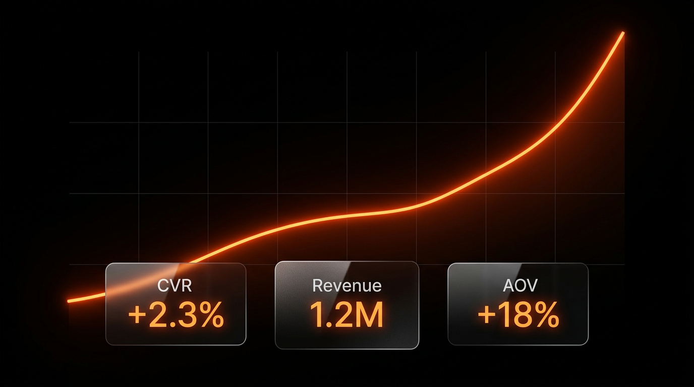
Each fix above moves the needle independently — 5 to 12% improvement for a single well-implemented change. Combined, they address every stage of the product page conversion journey: first impression (gallery, video), the trust checkpoint (social proof, delivery, returns), the decision moment (decision zone, sticky ATC), and the read-more phase (description structure). Brands in our Shopify CRO program that implement all 7 over a 90-day engagement see 30 to 50% lift in overall conversion rate — on the same traffic.
Frequently Asked Questions
What should a Shopify product page include?
A converting Shopify product page needs 8 elements: hero image or video, price with any savings framing, star rating and review count adjacent to the product name, add-to-cart button, delivery promise (one line), returns policy (one line), product description structured as a purchase argument, and a reviews section (only shown with 15 or more reviews). All except the reviews section should be visible in the decision zone on mobile.
How do I increase add-to-cart rate on Shopify?
The three highest-impact changes: build a decision zone (star rating, delivery promise, returns copy, and USP all visible adjacent to the add-to-cart button on mobile), implement a sticky add-to-cart button (8% mobile CVR lift), and apply the social proof placement rules (star rating near the price, one review quote near the button, full widget only with 50-plus reviews).
Why is my Shopify product page not converting?
The three most common root causes: the decision zone is empty (price and button only — no trust signals, delivery promise, or returns copy visible at the add-to-cart moment), reviews are shown with fewer than 15 entries (which decreases conversion by 7%), and delivery and returns information is not visible until checkout (by which point 49% of abandoners have already decided to leave).
What is a good Shopify product page conversion rate?
A 3 to 6% add-to-cart rate is competitive across most DTC categories. A purchase conversion rate of 2.5% or above indicates a well-optimized product page. The Shopify average is 1.4%. Above 3.2% puts a store in the top 20% of Shopify merchants.
Get a Free Product Page Audit
We audit Shopify product pages against all 7 of these fixes and identify the highest-revenue opportunity first. A specific diagnosis of what is suppressing your add-to-cart rate — and what to fix in what order.
Get Free Product Page Audit